


 |
| I asked my focus group as I went along to inform me on whether or not they liked a part of my magazine. Above is an example when I wished to find out if my logo was suitable and of a good standard to include. |


 |
| Georgia: 'I think that is looks simple yet still really effective and easy to read. The chosen colors go really well together, and the overlapping of the letters makes it look that little bit more professional. However, you could think about maybe adding a pop of pink as this would link in really well with the genre.' |
 |
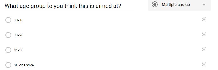
| This is the outcome of the new masthead that I have created when having taken into account what my focus group told me would look best. It meant having to adapt the whole overall house style of my magazine, but I think it looks a lot more realistic and comparable to a Pop magazine on the market. What target audience to you think my final overall design applies to?
Penny: I think that your target audience would be from around 11-16 year olds. Based on your house style I would have to say that the magazine is mostly targeted towards girls, as well as the actual content listed on the contents page also linking in well with the gender.
|
 |
| I have edited the lighting, brightness and contrast to the main image featuring on the front cover, ensuring it stands out and looks professional enough to support the brand of 'Pop Planet.' |
 |
| This is the main basis of my front cover, simply including the masthead. I have already began to figure out a color palette, which is blue to match the top that one of the models is wearing to show a brand identity. |
 |
| Now, I have added in the featuring articles that are going to be included within the issue, making sure the more important words are highlighted in a contrasting color. Also, small details such as the date of the issue, price and bar code are all conventions which allow the magazine to be portrayed as professional. |
 |
| The next varies changes that I have made is the masthead and position of the blue banner towards the bottom. I used Photoshop to create a new masthead that I felt was more professional and a lot easier to read. By placing a box around the outside of the main text involved with the masthead, it makes it stand out without drawing all of the attention away from the central image. |
 |
| Due to the fact that I decided to adapt the masthead, it therefore, means that the color palette has been changed slightly to ensure that the house style and typography is proved to be consistent. |
 |
| My focus group said that they think it would look good if I added a pop of pink to the front cover. Therefore, I have changed the house style completely to make it look a lot more like a pop magazine, I gained inspiration from already existing magazines. |
 |
Another major adaptation that I have carried out on the front cover of my magazine is making it look a lot more busy with featuring articles, creating more incentives for my target audience to purchase it. I used Photoshop a lot throughout this process, mainly to get rid of the white background around some of the images; meaning the outcome looks a lot more professional. |
 |
| I decided to choose this image for my contents page as I really like the colours as well as the direct mode of address from the model. The way she is positioned means that it is then easy to position the content on the page. |
 |
| This lesson I began to place some of the contents that will be included in my magazine in a transparent box at the side. Furthermore, the masthead is in the font 'prisma' which is the same as the font on the front cover to provide consistency. I downloaded this from 'dafont' which is a website that provides a unique variety of fonts. |
 |
| I have now begun to experiment with adding different features to my contents page. This involves a smaller image of my front cover to promote the latest issue. |
 |
| This lesson I wanted to push my skills slightly more so I have created an Instagram post personal to my magazine. I did this on Photoshop by using a template that I got from Google images. It looks professional linking in well with my target audience and is also a good way to interact with them. |
 |
| This is where I have begun to adapt the house style of my magazine regarding the color palette, adding in slightly brighter shades to match the front cover. |
 |
| The final changes I have made is to add more content involved in my magazine, adding in another Instagram post, adding the credits and photography, placing the logo from my front cover in the bottom right hand corner, including a website for a sense of brand identity and finally, there is now a tag line at the top of the page 'The Pop of a new generation.' |
 |
| This is the image that I have decided to use for my double page spread, I feel that it suits the topic of festivals very well due to the clothing and position of the models. It is more on the subtle side due to the fact that there is not a direct mode of address, which is what I wanted to go for as I want the article to be the main focus to my audience. |
 |
| Next, I began to place the article onto the spread and making sure that you can easily read the font. In the end I decided to go for a font named 'bell-rose' which did not print in capitals so worked really well. |
 |
| This lesson I spent the time putting the text into columns, this then means that I am going along with the codes and conventions of already existing magazines. |
 |
| I have no begun to experiment with different color palettes on the spread to see which ones work best. I feel as though the green shade links in really well with the idea of nature in the background of the central image. Also meaning that the black typography stands out well within the column. |
 |
| This lesson my aim was to include more codes and conventions from other magazines. So this therefore, meant that I have added in a drop cap on the first letter of the article which now looks considerably more professional. |

 |

 |
| This is a screenshot from a Pop magazine named 'CLASSIC POP.' I really liked the look of their masthead as I felt I needed to adapt mine to make it slightly more simple yet still effective in promoting my brand. The box around the edge of the text allows it to stand out more, as well as the contrasting colours they have used in terms of the black and red. Furthermore, I really liked the idea of making use of the inside of the 'O' by either placing text in the middle or even an image that relates to the masthead. |
 |
 Therefore, following on from the inspiration that I have found above I decided to adapt my original masthead and make it look a lot more professional. I carried out this process in Photoshop. The original masthead that I created is positioned to the left of the page, I liked the unique style however, I felt as though it could be difficult to read for my target audience, I have kept the font 'Prisma' the same as I feel this links in really well with my genre. As well as this, the letters were difficult to get straight which meant it did not fulfill the professional look I wanted to go for. Therefore, following on from the inspiration that I have found above I decided to adapt my original masthead and make it look a lot more professional. I carried out this process in Photoshop. The original masthead that I created is positioned to the left of the page, I liked the unique style however, I felt as though it could be difficult to read for my target audience, I have kept the font 'Prisma' the same as I feel this links in really well with my genre. As well as this, the letters were difficult to get straight which meant it did not fulfill the professional look I wanted to go for. |
 |
| This is an image of a drop-cap. I felt as though this is a really professional and easy aspect to carry out, it it popular across a lot of magazines no matter what the genre is. Therefore, there is a drop-cap included on my double page spread, InDesign made this easy to do and also look really put together. |
 |
| This is the front cover that I took most of my inspiration from in terms of how my own front cover looks. I really like the bright colours used as the house style as you can really tell that is is a pop magazine without even reading it. I also like the way the boxes overlap with each other. Furthermore, it is clear that there has been close editing on the boxes, making it look very professional. |
